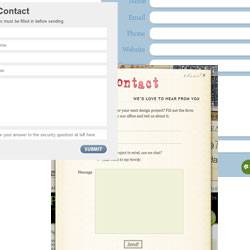
Lately I've been looking at my site and coming up with a few pain points that I'd like to address with some small redesigns of the site. My footer contact form (and it's 'contact page' counter part) are two items I would like to address. While they aren't bad they could definitely use some refinement.
So I have been doing what any designer does. I bought a copy of Snagit, which I will review later, and started capturing contact forms and form fields that I liked. I also tried to interact with the forms to see how they worked overall.
The Finding
Do you know what I found??? Lots of very beautiful contact forms that really were not very nice from a usability perspective. Sure the forms fit well with the site. Yeah they are gorgeous but they provide little to no visual feedback regarding which form field you are in. They provide no tooltips (a note for myself as well). All you have is, in some cases, a very tiny blinking cursor to tell you where you are on the form.
The Need
As designers it is our job to 'make things pretty' as much as we hate hearing that. But more than that we need to make things easily usable. You don't have to be a usability expert to do this. Rollovers are a very common thing to include in a site design. Any good design puts them in their navigation. We put them on links. Why no love for contact forms and form fields in general.
The Resolution
Here is my resolution. I am going to 'pretty up' my forms and form fields but not at the expense of usability. The next versions will offer tips for content entry. They will have rollover and active states. I will not be lazy.
Now I said it so hold me to it.
