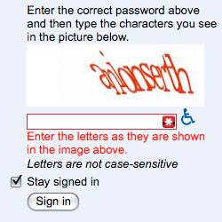
[caption id="attachment_1124" align="alignright" width="250" caption="Horrid CAPTCHA example"][/caption]
Hidden under the guise of making your life less troublesome by limiting spam on your site lurks a hurdle. It's a hurdle that brings no end of frustration to users. A stabbing pain in the eye of users and what does it gain us but a few precious seconds of our days.
The Issue
We've all dealt with CAPTCHA's. You know that squiggly piece of crap that is supposed to test if you are human. Google even recommends using CAPTCHA to help control the spam you get for registrations or comments.
While I understand the need to control the spam bots lurking out in the ether this problem is not the problem of your website users, so why are we forcing it on them to solve? Really some CAPTCHA's are so twisted that future generations will enshrine them in museums as the torture implements of this net enabled generation.
Really to get people interacting with you online you need to break down barriers and make the hurdles as small as possible. Google's webmaster central recommends that we build sites for users then recommends you use CAPTCHA's. Does one hand know what the other is doing?
Captcha's aren't built for users they're built for website owners. They take the problem of spam control and make it the problem of our website visitor. Would you go to a brick and mortar store that had a test to make sure you had cash to buy right now? I mean that's a challenge and response to make sure you fit their profile right?
The Better Way
So we've established that CAPTCHA's not only suck but they take a problem on our end and make it a user's problem. “There has to be a better way” we all scream.
There is at least one system I know of that doesn't push my spam control issue onto my users. It's used just below for comments and comes bundled with any WordPress installation, Akismet.
Akismet uses some fancy algorithm to figure out what is spam and what isn't. I don't have to manage it I just check once a week quickly to see if there are any false positives which has never happened on the blogs I manage regularly.
Another option is a honey pot form element. Push it way off the side of the site. If it's filled in you have a spammer so you throw out the submission.
Simple logic puzzles are another way to try to drop the bar lower but still get a challenge response from users. You'll see this on some of my forms that ask “What colour is snow?” Still this is a hurdle and in my mind less desirable than no extra steps from the user. In fact I'm actively looking for a different form plugin for WordPress because of this.
The End
So let's band together and try to make sure we don't push pain on our website users. Rather then wasting time trying to kill IE6 let's throw our effort behind killing the CAPTCHA.
And now for some fun. Let's stop and look in absolute disbelief at the horrid CAPTCHA's shown below.
[caption id="attachment_1125" align="aligncenter" width="500" caption="More terrible CAPTCHA examples"][/caption]
