https://youtu.be/IH6-0IrFwLI
While I’ve been reliant on paper based productivity for a while now, there is something about a digital task manager that still seems useful to me during times that my business is ramping up in complexity. I started this review in late September 2018 when I had 3 code projects going, 6 writing assignments for a single client, and 3 other writing assignments going. This was on top of working on The Freelancer’s Guide to Getting Started and doing my regular podcast and YouTube work.
As I finish this off and ship it, I’m in a similar boat with 2 development clients. One content client, and then 3 other clients I write for monthly that need work shipped.
My Analogue Productivity system didn’t feel like it was cutting it so I turned to Things 3. I had heard so many good things about it and hadn’t looked at it in years. Today we’re going to do a fairly extensive walk through with Things 3 from Cultured Code.
Way back when Things first came out I was a user of their platform. I remember, not fondly, syncing tasks via WiFi with my computer and my iPod Touch. At the time Things was a great task manager given the constraints of the day. After that I switched to OmniFocus for a while, in large part because it took way too long for Cultured Code to get in the game with a good sync system for tasks.
In fact, the delay in updates to Things was so bad that I wondered many times if the company was going to be around at all. Luckily, with the introduction of Things 3, we have seen a great update pace. After sitting out for a while I because I wasn’t sure they’d keep it up, they’ve regained my trust such that I could recommend Things as a great task manager that someone could use for the long term.
As we dig into Things 3, it’s important for you to understand exactly where I’m coming from. I am a web developer and writer. I manage my own book projects and client writing projects, alongside projects for web development clients. I podcast and do YouTube videos and I do all this as an iOS first user.
Yes you read that right, I build websites using my iPad. I record podcasts, and edit YouTube content all from my iPad.
I won’t even be looking at Things for macOS, so if that’s where you’re at this may not be the perfect review for you. I’ll be exclusively looking at how Things 3 works on an iPad and an iPhone. If there is some feature that you can do in macOS but not on iOS, it might as well be dead to me. In fact, it might as well be dead to many users now as so many people move to a tablet only workflow.
Without further delay, let’s dig into Things 3.
Getting started with Things 3, they have a nice task walk through in the form of a project in Things that you can step through. It does a great job of introducing you to 99% of what you’ll be doing with Things 3, without overwhelming you with that extra bit of power that’s under the hood.
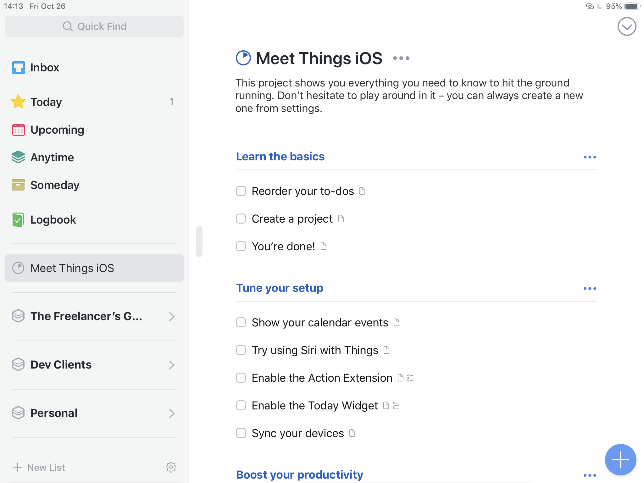 Things 3 built in project to teach you Things about Things 3
Step through the project and you’ll get a good tour of the interface of Things. You’ll understand how to interact with it and really not be missing anything that you may need in a standard workflow for productivity.
Dealing with Tasks in Things 3 iOS
One of the features I loved in 2Do was the little “lightning” icon at the top of a task entry. This allowed me to add a task, and then jump directly into the next task. At first I thought that Things 3 didn’t have a way to add many tasks quickly but then I accidentally pressed CMD + N once I was finished entering my first task. This drops you directly into the next new task while submitting the one you just entered.
While Things 3 doesn’t allow nesting of tasks like OmniFocus does, it does allow you to add a simple checklist to a task. I’ve often used this when I'm heading to the grocery store. Going to the store is a single task, and the items I need are in the list. Unlike adding new tasks, adding an item to the list drops you directly into the next item without needing to “add” it again. That makes adding the stream of consciousness list my wife and I make together so much faster to enter.
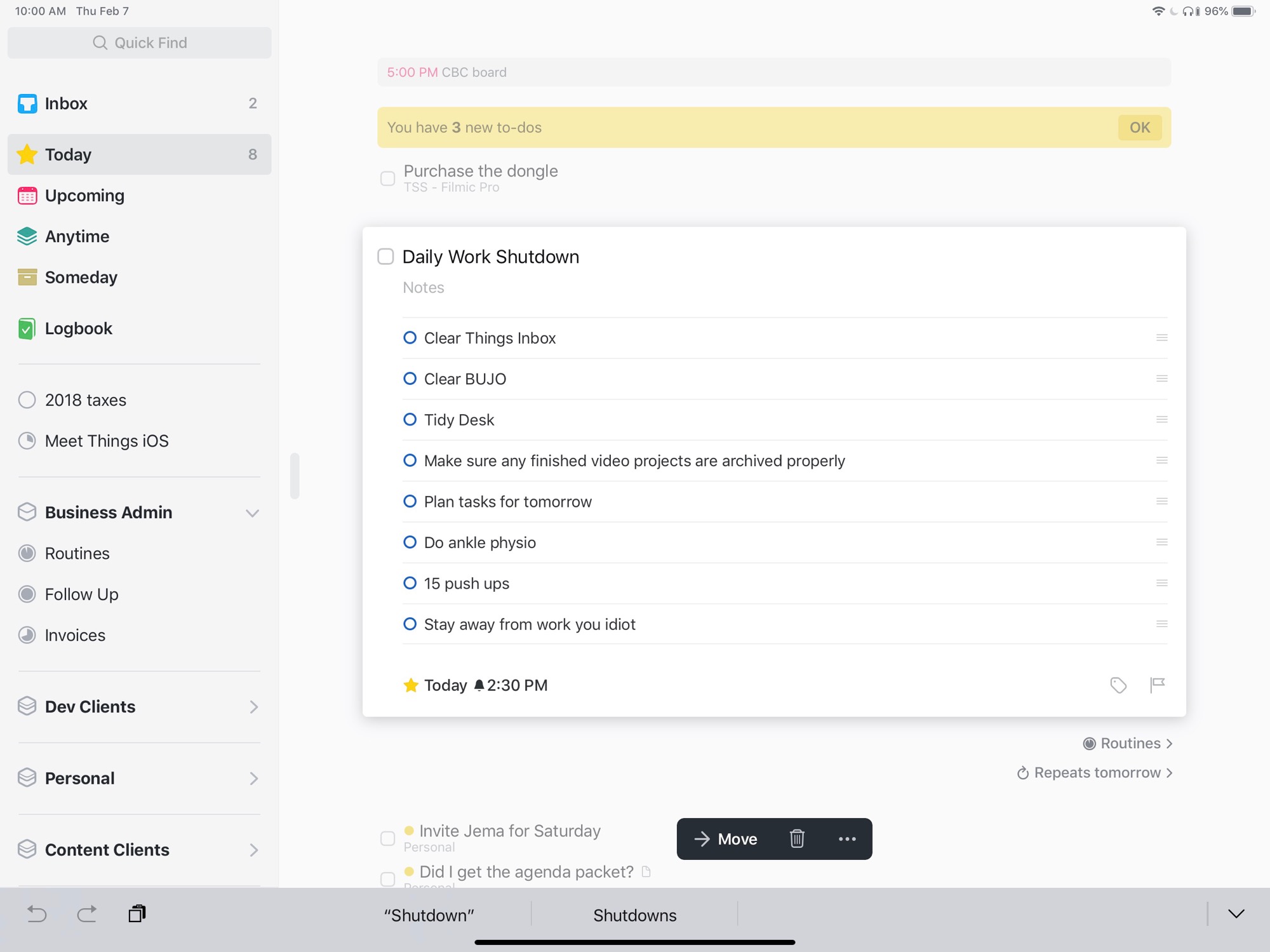
You also saw this in my video on using Things 3 to track my routines. I added the things I wanted to do to shut down my day to a checklist on a task. Then the task got a recurring reminder associated with it. I even went as far as allowing Things 3 to alert me. That meant it was the only application which was given that privilege on my iPad.
While Things 3 wasn’t built as a GTD only client, many people use GTD methods with it. In GTD parlance you have Contexts. A Context is a person, place, or thing that you need to accomplish a task. When GTD was first popularized you may have added a Context of phone to tasks that required you to be near a phone.
In many circles this method of breaking out your tasks has fallen by the wayside since we all carry at least one device that can do almost anything in a Context. Instead of strict Contexts, Things 3 has tags. You can put as many tags as you want on a task. You can nest tags. Tags are the future so much so that even the latest version of OmniFocus has moved to tags from Contexts.
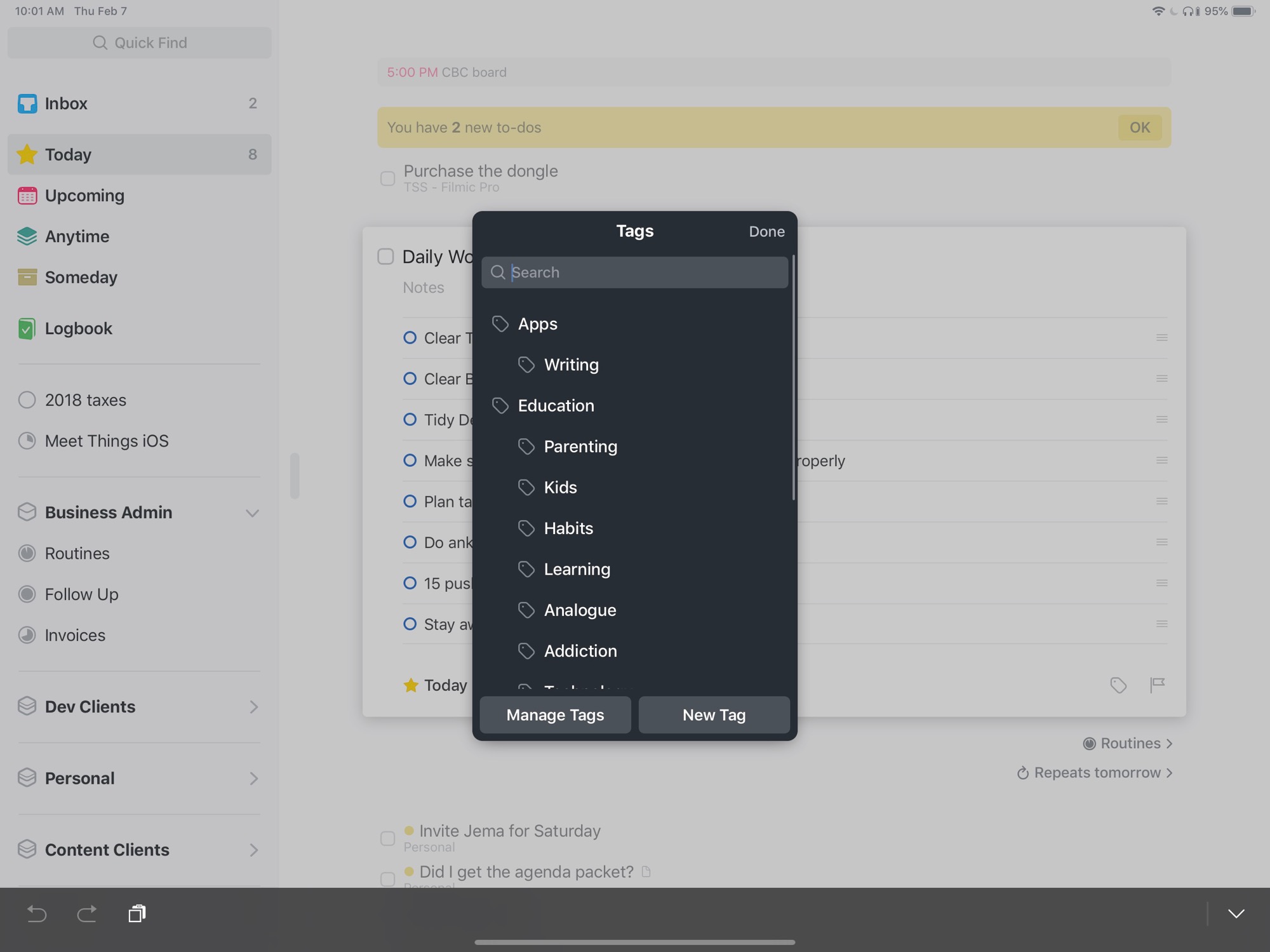 Task tags in Things 3
As I already mentioned when I was talking about my routines, Things 3 has a robust way to repeat tasks or projects. You can choose to repeat either once they’ve been completed or at every matching interval even if one instance was not completed.
For tasks, I used this with my routines. If you’re looking at a projects, maybe you need to repeat some monthly house chores. Put them all in the project and then set an interval for repeating it and you’ll see all the things you should be doing around your house.
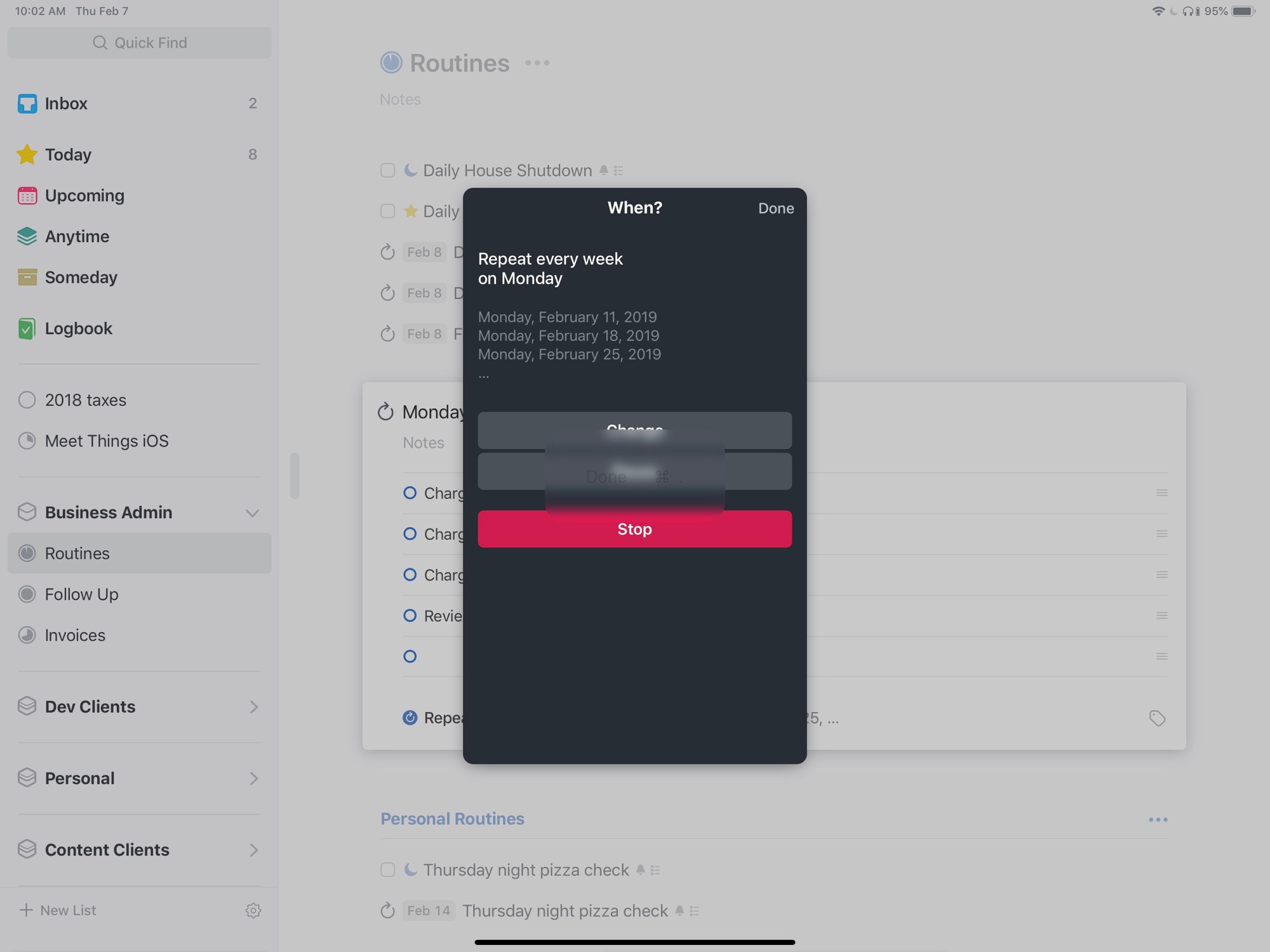 Building repeating tasks for Things 3
When I was looking at starting to build some repeating tasks, it did take me a few minutes to find the UI for this. I even made a note in the original version of this review that the UI felt a bit hidden to me. Even double checking that statement it took me a minute to find the screenshot I needed to take to build a repeating task.
To clear this up, and hopefully ingrain it in my mind, select a task and then press the three dots that show up in the bottom of the UI. A popup menu will appear and then you’ll see your repeating options for your task. Luckily Things 3 comes with a full suite of keyboard shortcuts and to repeat a task you would use SHIFT +CMD + R. Then the UI pops up directly without hunting for those little dots.
Now one place that Things 3 for iOS did entirely fail me is in its lack of ability to add any type of file. I found this out while shopping with my wife when she mentioned that she liked a sweater. I took a photo of it and then spent 5 minutes trying to figure out how to attach it to a task so I could maybe purchase it for her for Christmas.
If you’re an iOS user, there is no way that I have discovered to attach a file directly to a task in Things. You’ll need to add it to something like Bear and then copy the link to the note and paste it into the notes for your task in Things. This seems like a fairly huge oversite to me. I don’t remember a time when competitors like OmniFocus couldn’t attach a file directly to a task from their iOS applications.
Getting Tasks from Other Places into Things 3 iOS
Outside of switching to Things on your iOS device, there are a number of ways you can get tasks into things. Things shows up as an option in the share sheet, though I missed it at first.
See, OmniFocus and the other task managers I had on my iPad at the time all showed up in the top row. I searched for the Things icon and didn’t see it. I even searched to see if such a simple feature was missing and was happy to see that it wasn’t. Things shows up is the second row in grey/white instead of the top row with it’s regular coloured icon.
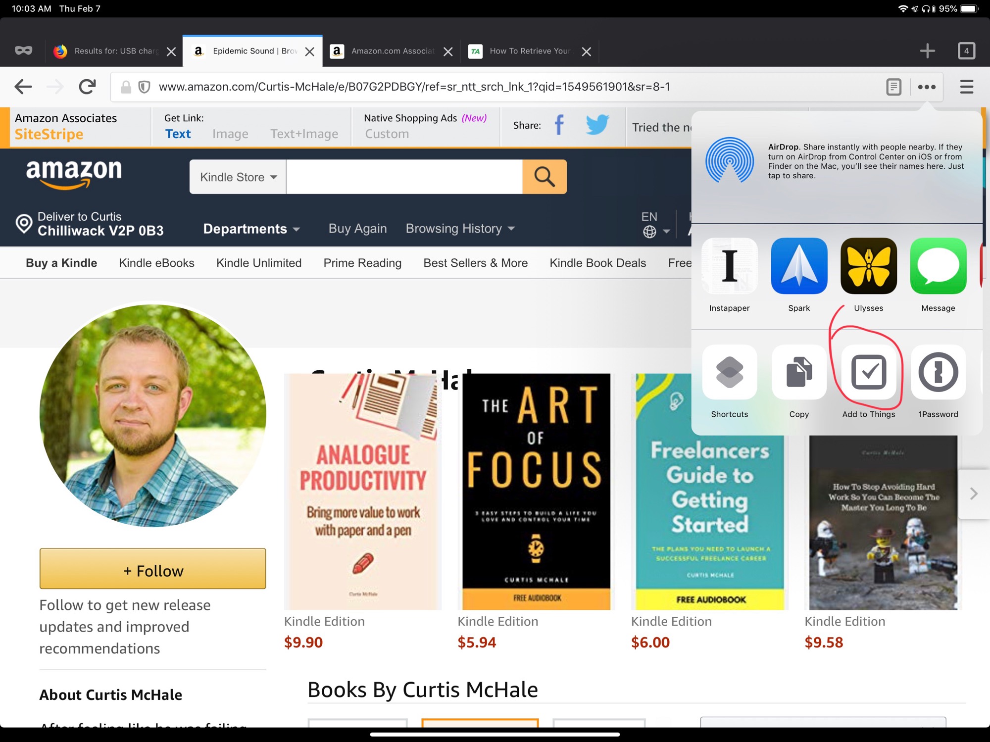 Things 3 in the bottom share sheet
I have no idea what the difference is, but it seems odd to me since all the other task managers I’ve used sit in the top row.
I also found some issues with the share sheet. One annoyance was trying to share a link from Slack to Things so I could deal with it later. Things simply wasn’t an option at all for the data that Slack was trying to send. I ended up having to copy the link, open Things and then paste it in to Things.
Another issue with Things and it’s Share Sheet functionality is that you can’t do anything but send your task to the inbox. No setting the date. No filing it in a project. I guess that’s “canon” GTD, but it means I have to go touch a task again instead of just dealing with it a single time.
If you choose to sync your Things library with their Cloud service, which is the only way to sync...so you’re going to do it, you can also choose to turn on their Send to Things email option. This will allow you to email items into Things from anywhere.
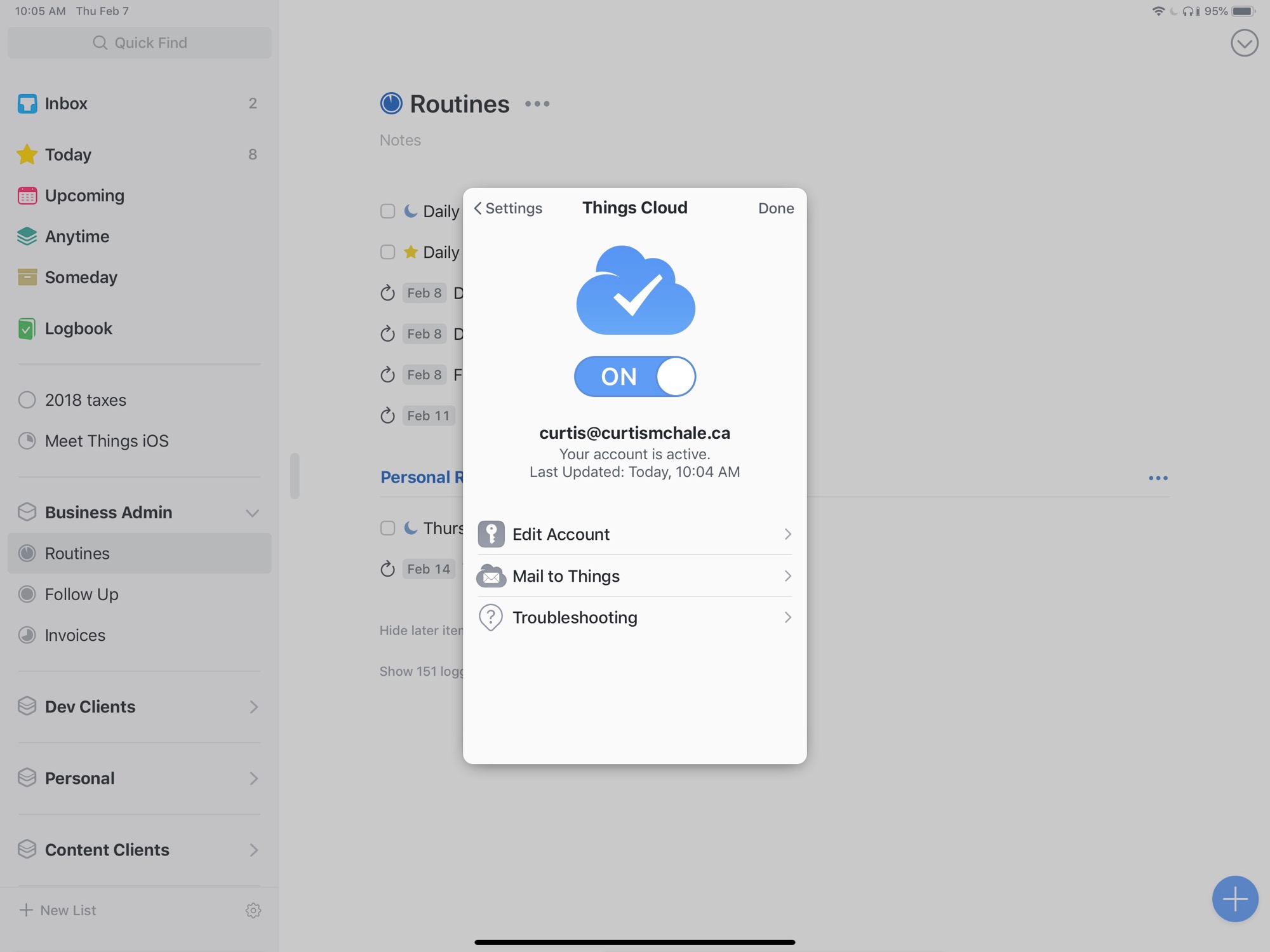 Things Cloud sync
Even if you attach something to this email, the attachment won’t show up in Things. It will however link directly to the sent email. Now if it’s you sending yourself and email, you’re all good. If you’re trying to use the email functionality to have some other service send you something then you’ll just miss the attachment.
Maybe you’re trying to have your CRM send you client information when they perform and action and that needs an attachment. You’ll be able to see the body of the message in the task notes, but you’ll be lost on the attachment.
While this isn’t specifically a problem with Things 3, I hate how Spark deals with sending emails into Things. The fact that it opens up the application forcing me to change back to Spark to deal with the next email sucks. Like I said, this isn’t a problem with Things 3, it’s a problem with Spark, because it does this with every integration that it has in it’s library.
https://youtu.be/DELSASXvB60
There are two ways this could be made better. First, like the Bear integration, we could get more data fields in the integration with Things 3 and Spark. If I could set the due date or assign the project directly in Spark before it opened Things I’d be a slightly happier camper.
Even better would be to add that task with the extra fields in Spark and then either I never see Things, or it opens it adds the task and then I get sent directly back to Spark again so that I can keep dealing with my email.
Sorting and Organizing Tasks Projects and Areas
There are 5 levels of hierarchy to organize your tasks in Things 3. First off you have the basic task level. Inside a task you can have a checklist.
Tasks can exist inside projects and projects can exist inside areas. Then comes the outlier of headings. Headings can go inside a project and they divide up the project into different sections.
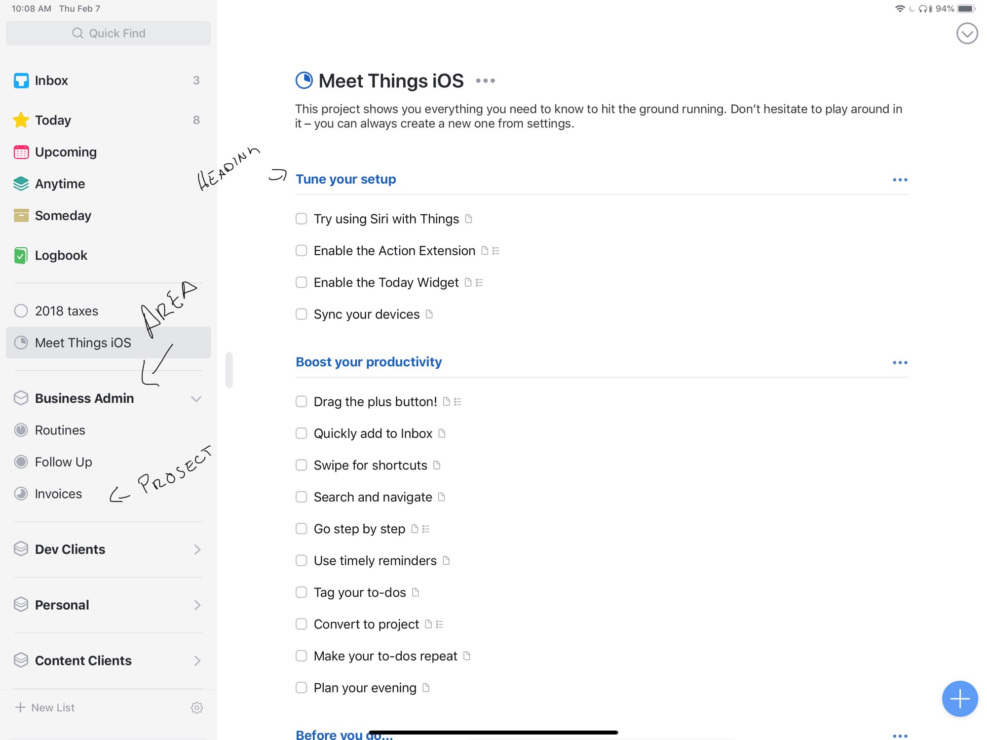
I call this an outlier because I’ve struggled to find a good use for them. The best I’ve got is to split up my Routines project so that I can quickly see which routines are personal and which routines are more business focused.
Projects work like you'd expect projects to work if you’ve used any type of task manager or project manager before. I have projects for individual clients and for some clients, for individual writing projects.
As I’ve said, projects can exist inside areas. Areas are for groupings of projects. So my Client Writing Project has writing work for a number of different clients.
Areas can also contain their own tasks. Let’s say you have an Area for web development and you want to remember to follow up with some clients long term. You could put these follow up tasks inside the Web Development Area. They wouldn’t exist inside a specific project, but sit right inside the Area.
One thing I’ve noticed is that it’s been easier for me to miss tasks inside an Area when I’m doing my review. I remember to look at the projects, but forget that tasks can exist inside an area as well.
Now, Areas don’t have to relate to a broad topic. I have an area for my next book The Freelancer’s Guide to Getting Started. An area is simply a collection of related projects, so don’t get stuck in a rigid minded about how you use them.
Once you understand the different ways you can organize your tasks, it’s time to start sorting them. I’ll cover this deeper in a bit but, Things has an awesome set of keyboard commands. You can do any of the sorting actions you want directly from the keyboard without touching the screen.
For the times when you’re not using a hardware keyboard, Things has a great set of gestures to help you sort through your tasks. You can swipe from right to left on a task to activate the multi-select option. With multi-selection activated, you’re ready to grab all the tasks you want to move and then use a single operation to move them to another project.
The difference between deadline and “when”
When it comes to dates with your tasks there are two option in Things. You can set a Deadline or a When date. There is a subtle difference between the two.
When you add a date using When in Things, you’re saying that you want to work on a task on a specific day. You are not however saying that it has to be done on that day.
When you set a Deadline you’re saying that a specific task must be done on that day. When you use a Deadline red text will show up on the right hand side of the task if it’s overdue. This red text does not show up if you use When.
You can set a Deadline from the keyboard or by pressing the calendar icon on a task. When can also be set from the keyboard, or by swiping from left to right on a task.
Things 3 and This Evening
One of the interesting ideas in Things is their designation of This Evening for your tasks. I often have something I want to track that’s not a work task, but I need to write it down or it won’t happen. Tonight I need to make sure I have fine grit sandpaper for my palm sander so that tomorrow I can sand a dresser we’re refinishing.
Instead of this being cluttered up with my work tasks, check sandpaper is sitting in this evening which is when I can tackle the task.
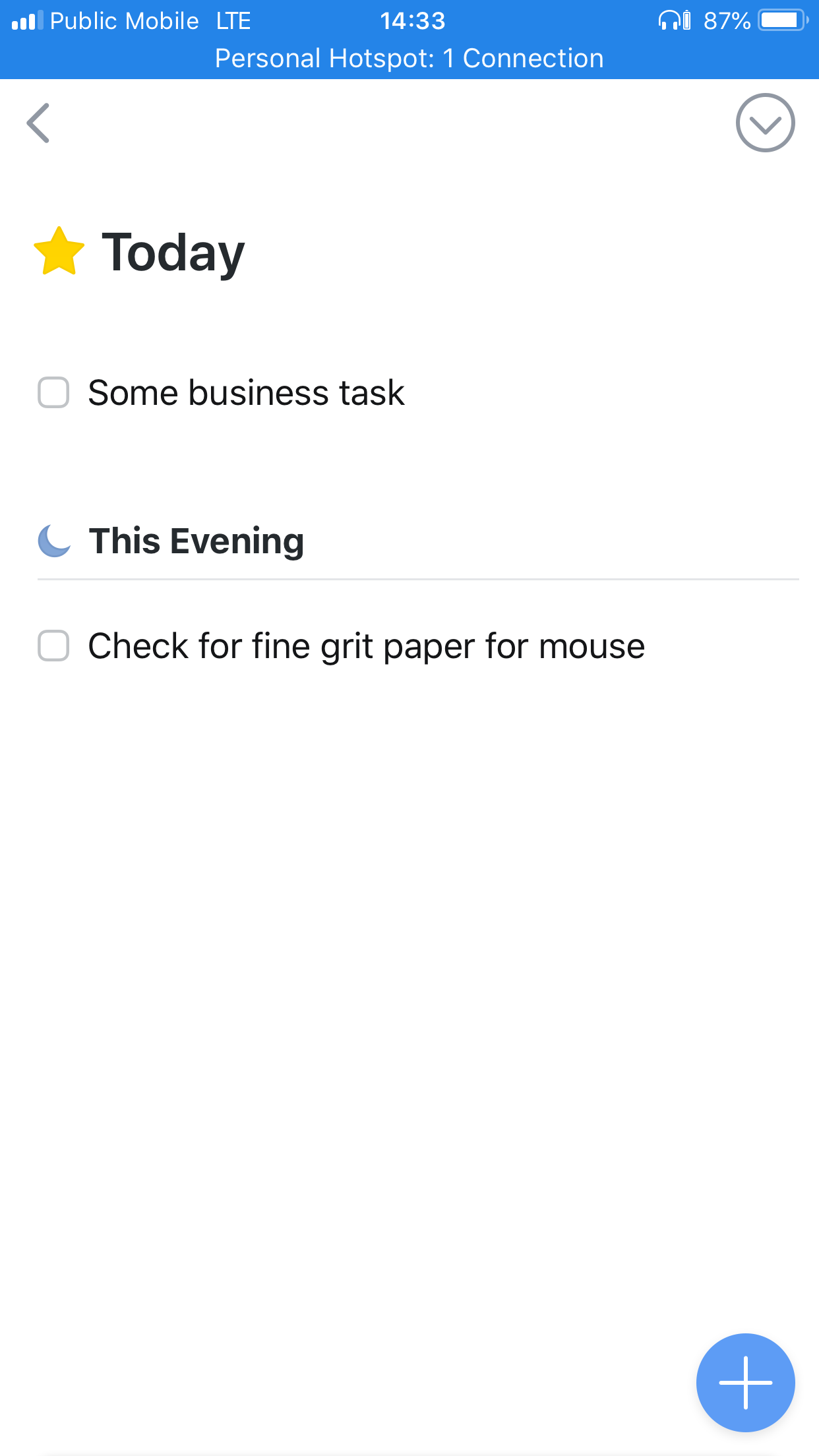 This Evening in Things 3
Yes, you can achieve this with other task managers by playing with the time that tasks are due and then having a custom view that only shows tasks that are currently inside the time window. This seems just a bit more ‘fiddly’ though. Having This Evening as a time to sequester tasks feels much nicer day to day.
The only problem I have with This Evening is that I have yet to find a way to set recurring tasks to always show up as an evening task.
Syncs Cloud and Syncing
One of the issues I’ve had with 2Do is that the sync is slower than I’d like. I always felt like I was opening up 2Do and then waiting for the application to sync. While using Things 3, I never felt like I was waiting for tasks to sync.
In Things 3 you enable syncing by going to the gear icon in the bottom left corner. From there choose “Things Cloud” and you can setup your Things Cloud account.
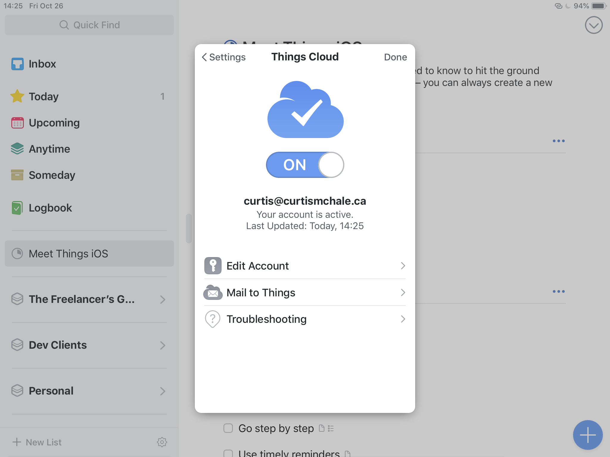 Setting up your Things Cloud Account
No Things doesn't allow you to sync with any old cloud service. They don’t allow this because allowing sync via Dropbox or iCloud is prone to errors. As I write this we’re looking at an Apple event at the end of October 2018 and we’re getting reports of issues with iCloud syncing for apps. I’m getting no issues with Things 3, because they’re handling it themselves.
Of course this also means that if there is an issue, we’re sitting on a smaller provider than Apple. It’s certainly possible that their system is less robust than what you'd get with some huge company. In practice, I haven’t seen issues reported with Things task sync.
Searching Tasks in Things 3
Things 3 has a robust search built directly into it. Having used OmniFocus though, I was disappointed that I couldn't save any of the searches I performed. That’s essentially what Perspectives in OmniFocus are...a saved search.
This means that if you have a set of tasks you regularly search for...you’re going to have to type the search in every time. This bit of extra friction sucks.
Things 3 and Design
One of the big things you hear as you start to look into Things 3 is that it’s beautiful. People go on and on about the design and the animations and the icons.
Yes, Things 3 is beautiful. Yes, we should expect good looking applications that are designed thoughtfully.
In a previous screencast I said that as I started using Unread, it defined the reading experience I expected from my other applications like Pocket and Instapaper. While I concur that Things 3 is great, I didn’t feel like it redefined my definition of what a good app should be in the same way that Unread did.
So, let’s just say it’s a well designed application and leave it at that. Others can opine on how thoughtful it all is.
Navigating Things 3 iOS from the keyboard
Back when I looked at Unread, one of my issues was the lack of any keyboard navigation at all. For such a beautiful app, the lack of keyboard features means that it feels like a labour to use it when you have a keyboard in front of you.
Luckily, Things 3 doesn’t suffer from this problem in any fashion. With the Things 3.6 update Things 3 brought us a full suite of keyboard shortcuts. Seriously, they have the most keyboard shortcuts of any iOS I’ve encountered so far. This makes the Vim user buried deep inside giddy to the point of throwing up rainbows.
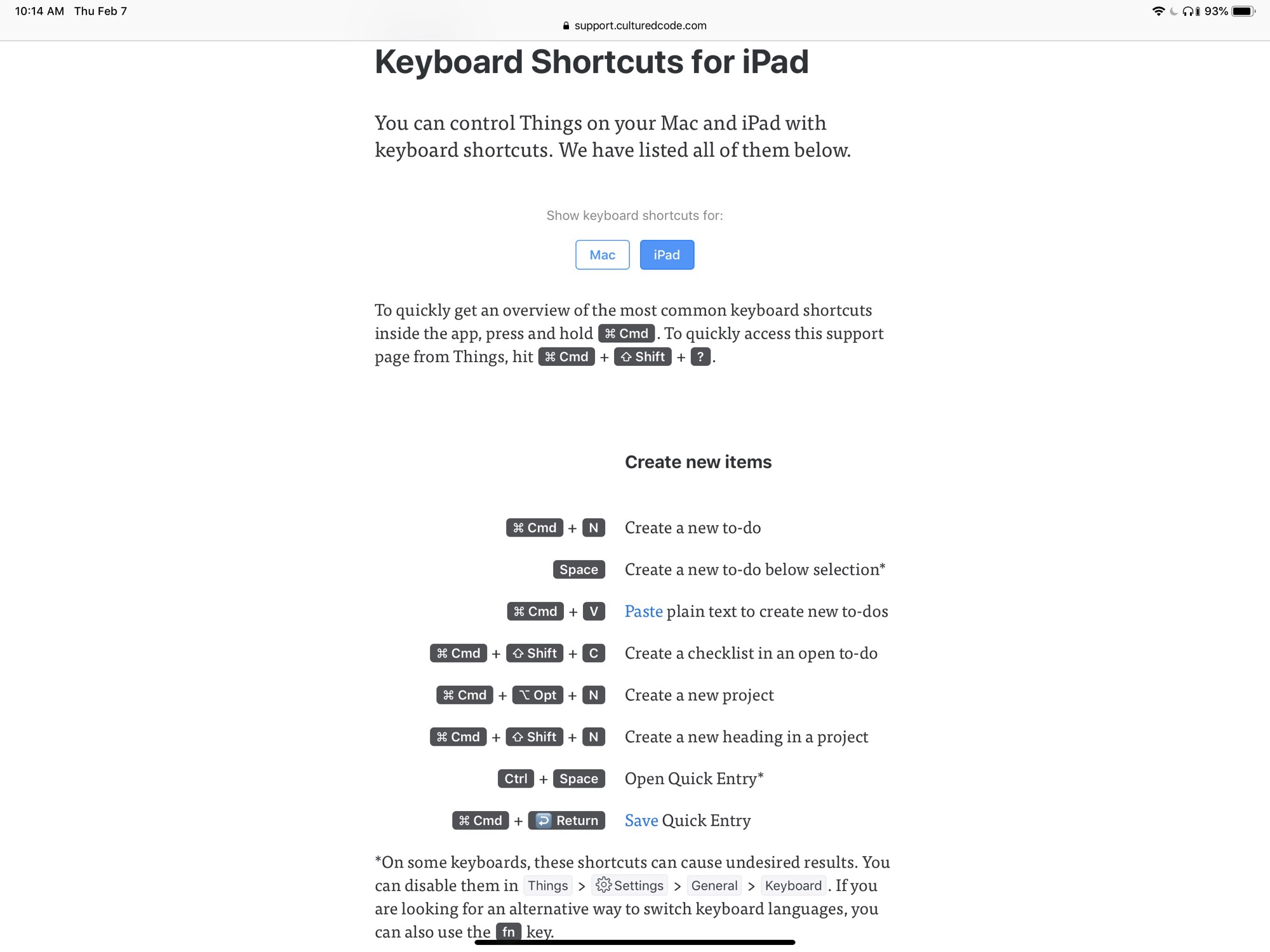
Kidding aside, it’s wonderful to see iOS apps taking keyboard users seriously. Starting with iOS 11 we had a big leap towards making iOS viable for so many people as their fulltime computing device and iOS 12 only continued to cement iOS as my single computing device for everything from recording and editing YouTube videos to building websites.
Using Things 3 and GTD
I’ve already said it, but Things 3 is a very powerful task manager for those that want to follow GTD practices. The biggest thing you may want is some more power to slice your tasks up like you’d find in perspectives from OmniFocus, but that’s about it.
As I keep saying any time I talk about task managers, the review feature in OmniFocus is so amazing as to render anything else I’ve seen a pale shadow of a comparison. In this case, Things 3 offers no specific review functionality so you’re left to your own devices to go through every project and check the tasks that are available.
I actually prefer this to some half-baked review functionality that barely implements a part of what OmniFocus has. Do it well, or leave it alone until you can. Maybe never do it at all if you have other priorities.
Most task managers just don’t touch a specific review feature, though I wish some more would so we could get different takes on what a review looks like.
Notifications and Badges in Things 3
Just like other iOS applications, Things has support for all the notifications in iOS. You can get badges and banners and any other manner of interruption that iOS allows. I have Things setup to only remind me about my daily routine stuff, so I really don’t see any of them in my regular day to day.
One of the best features in Things the lack of a subtle guilt trip about tasks you didn’t get to on the day you had hoped to. Where most other task managers show those tasks as overdue, with appropriate red text and guilt, Things leaves the task in the Today view and leaves you alone.
The only indication that there is a task you haven’t finished it is a subtle bit of red text to the right of your task showing you how many days a task is past the deadline you set for it.
What about Things 3 for macOS or Apple Watch?
I honestly have no idea. I never purchased it and the only way I’m familiar with it is because I looked at a few other reviews as I was working on mine to make sure I didn’t miss anything obvious and look like an idiot.
As I said in the introduction I’m iOS first, I really don’t care if there is a macOS version of an application with more power. I want iOS applications that are just as powerful as the macOS versions could be, within the limits of what iOS allows.
The other thing I don’t own is an Apple Watch. Yes, Things 3 has some features that you can use on an Apple Watch. I didn’t look at them because I don’t use them and I don’t care for a smart watch of any fashion.
Verdict on Things 3
If you’re looking for a solid task manager, then Things 3 is certainly one of the options on your short list. But before you even look at a task manager you should start by asking yourself what the problems are with your current system. Only look at options that solve your problems without introducing a bunch of new ones that will annoy you more.
To wind up my review, I’m not using Things 3 anymore. I added more project management Collections to my Bullet Journal and then felt like everything was under control again.
