We’re almost done looking at RSS apps for use on your iPad so that we can make a final pick of the best RSS application for iPadOS. Today we’re going to look at Lire.
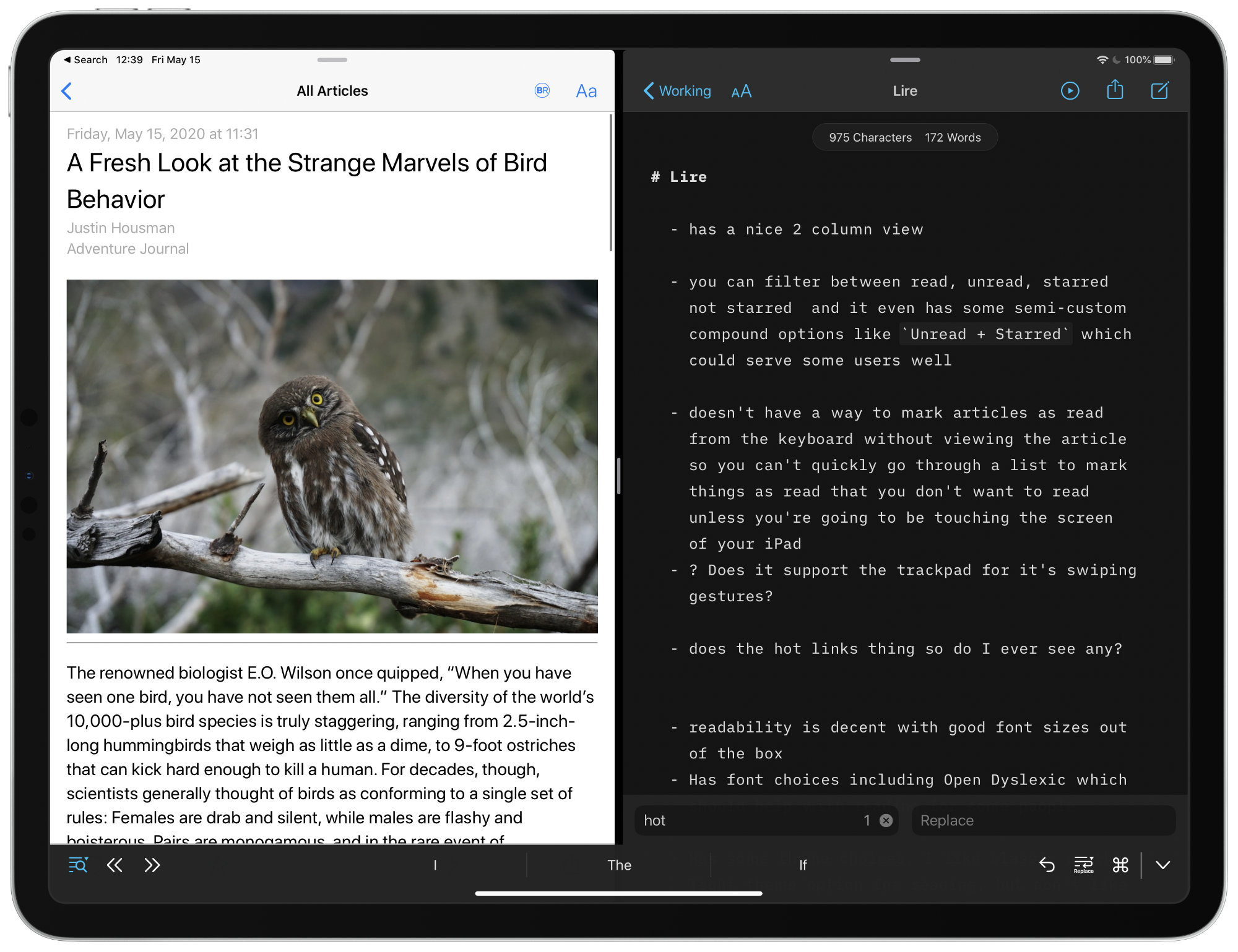
To start, Lire has an understated pleasant 2-column design. Nothing flashy here, just easy reading and clean lines.

Lire allows you to filter articles between read/unread, starred/unstarred and even has some semi-custom compound filters like Unread + Starred so you can see exactly what you want. Like Fiery Feeds, Lire will show you “Hot Links” which surfaces links that are showing up in a number of your feeds. Also like Fiery Feeds, with the feeds I follow I never found it useful.

Lire has a few keyboard commands, but seems to be missing a few crucial ones, like the ability to mark an article as read from the main article list. Yes you can reach up to your screen and swipe an article from left->right to mark it as read, but no you can’t do it with a two finger swipe on the trackpad. This was disappointing because otherwise you can navigate very reasonably well in the Lire interface with the keyboard.

Another curious keyboard shortcut issue is that you must use left/right to navigate up/down on your list of articles. This was always confusing to me and needs to be changed.
When it comes to reading in different split screen setups on the iPad, Lire is excellent. Unlike Fiery Feeds that had huge margins making the reading experience less than good, Lire has reasonable margins and is a pleasant reading experience in all scenarios I found.


Out of the box I found the font sizes to be fine. If you want to tweak them Lire has a bunch of options for you to use. If you’re into it, there is also Bionic Reading. Like is said when I reviewed Reeder though, I have no idea why someone would use Bionic Reading.

On the theme front, Lire has a few choices. I tried a bunch of them and stuck with the default theme. It had the best balance of what I like in a theme.
Should You Use Lire?
The truth is that this app was hard to review because I didn’t enjoy using it at all. The lack of keyboard navigation and weird choices made in some of the keyboard commands meant I was simply frustrated every time I was trying to work through my RSS feeds.
If you use your iPad with a keyboard lots and want to be able to navigate your applications from that keyboard, then Lire isn’t going to be for you. If you’re mainly using your fingers to interact with application interfaces, then Lire may be the right choice for you.
Come back next week to see which RSS I think is the best option for iPadOS and iOS.
